
Home Assistant Dashboards in 2026: What Changed and the One-Click Mistake
Home Assistant rebuilt dashboards across five 2026 releases. What you see now, how to add cards, and the edit that can't be undone.

Researched with AI assistance, reviewed and edited by Tapabrata Biswas.
In this article
- 01What is a Home Assistant dashboard?
- 02What you actually see on a fresh install in 2026
- 03The one-click mistake you can't undo
- 04Sections or masonry: which layout you have
- 05Adding a card, which changed in June
- 06Why a second dashboard is usually the answer
- 07When the default is genuinely enough
- 08What this post does not cover
- 09Sources
Five Home Assistant releases changed dashboards in 2026, and one of them replaced the default entirely. If you're reading a dashboard guide written before February, it's describing a screen you no longer have.
That churn is the reason this guide leads with what's on your screen now rather than a tour of card types. It also leads with the one edit worth understanding before you make it, because Home Assistant's own documentation says you can't undo it.
What is a Home Assistant dashboard?
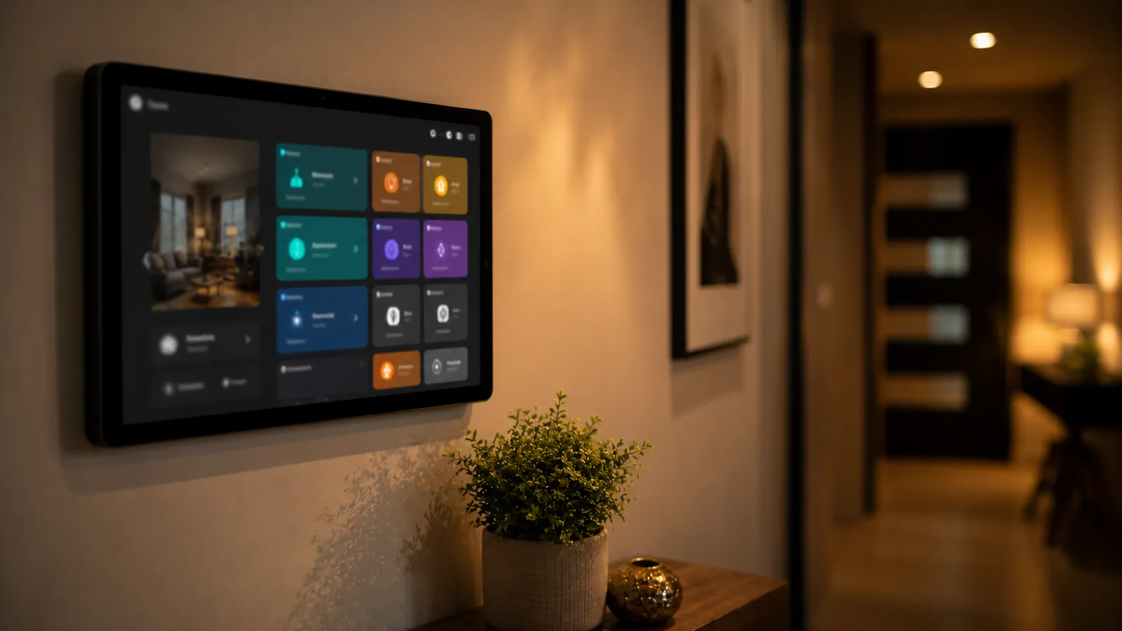
A Home Assistant dashboard is the screen you see when you open Home Assistant: the at-a-glance view showing which lights are on, the temperature in each room, who's home, and what's happening right now. From it, one tap dims a lamp, starts a vacuum, or arms an alarm.
Dashboards are built from cards. A card displays something or controls something, and you arrange cards into views, which are the tabs across the top. You can have several dashboards at once, which is how people end up with a detailed one for themselves, a simple one on a kitchen tablet, and a stripped-back one for guests.
None of it requires code. The whole thing is drag and drop, and YAML sits underneath if you ever want it.
What you actually see on a fresh install in 2026
New installations get the Home dashboard, which replaced Overview as the default in Home Assistant 2026.2. It's not the same screen older guides describe.
The Home dashboard opens with a For You section that surfaces devices Home Assistant has discovered on your network but you haven't set up yet, prompts you to assign devices to areas, and shows primary sensors like temperature and humidity for each area once you have. The blue top bar that defined the old look is gone, replaced with a flatter theme meant to keep attention on your cards.
On phones, that layout goes further. Since 2026.1, the mobile Home dashboard puts summary cards for lights, climate, security, media players, weather, and energy at the top of the screen, then your favourites, then your areas. Desktop keeps its summaries in the sidebar under a For you heading instead.
Anyone who preferred the old arrangement can still have it: Settings, then Dashboards, then Create, and pick the Overview (legacy) template. Long-time users who never customised their default get offered the switch rather than having it forced.
The one-click mistake you can't undo
Editing the default dashboard permanently stops it updating itself, and Home Assistant's documentation is blunt about it: once you've taken control, you can't get that dashboard back to updating automatically.
The mechanism catches people because it looks like an ordinary edit. Built-in dashboards regenerate themselves as you add devices, so a new smart plug appears without you doing anything. The moment you take control, that stops. Your dashboard freezes as a snapshot, and every device you add afterwards is yours to place by hand, forever, on that dashboard.
Home Assistant's own advice is to leave the default alone and create a separate dashboard to play with. That's the whole fix, it costs nothing, and it's buried in the docs rather than shown at the moment you click edit.
If you've already done it, you haven't broken anything permanent. You can create a fresh dashboard that auto-updates and keep your customised one alongside it. What you can't do is convert the customised one back.
Sections or masonry: which layout you have
Sections has been the default view type for new dashboards since Home Assistant 2024.11, and it's the only one where you can drag cards into place.
Worth stating plainly because several guides ranking for this topic get it wrong: Sections arrived as an experimental option in 2024.3 and became the default in 2024.11, when it came out of that experimental phase. If a guide tells you Sections has been default since 2024.3, it's describing eight months that didn't happen that way.
| View type | What it does | Drag and drop |
|---|---|---|
| Sections (default) | Groups cards into blocks on a grid, with headings and per-section themes | Yes |
| Masonry | Packs cards into columns automatically | No |
| Panel | Shows a single card filling the screen | No |
| Sidebar | Two-column layout with a narrower side column | No |
The reason Sections exists is worth knowing, because it explains a frustration you may have already had. Home Assistant's design write-up says Masonry lays out cards by a logic that isn't predictable to most people, that card positions shift when the screen size changes so your muscle memory for where things are gets lost, and that a height difference as small as one pixel can send cards jumping to new places. They also concluded that masonry packing, multi-screen compatibility, and drag and drop simply cannot coexist. Sections was the trade they made.
Existing masonry dashboards were left alone through all of this. There's a conversion tool that moves your cards into an imported cards section if you want to switch.
Adding a card, which changed in June
Home Assistant 2026.6 reversed how the card picker works: it now asks what you want to show rather than which card type you want.
Open edit mode with the pencil icon, choose Add card, and the dialog opens on a By entity tab. The left side lists your floors, areas, devices, and entities. Pick the thing you care about, a living room lamp or an outdoor temperature sensor, and the right side fills with live previews of the cards that suit it, rendered with your actual data rather than placeholder values.
The old flow ran the other way: a wall of card types with names like Entities, Glance, Tile, and Picture Elements, which meant guessing what a card was before you could see what it did. If you learned dashboards the old way, the new picker feels like it's missing options. It isn't; you're just entering from the other end.
A few smaller additions from the same year are worth knowing about because they remove common workarounds. Heading cards gained button badges in 2026.2, so a section heading can carry quick actions. The area card in the same release lets you choose individual entities as controls rather than all lights or all switches. And 2026.5 added a Shortcut card that jumps to another view, launches Assist, or fires an action like turning everything off.
Why a second dashboard is usually the answer
Building a second dashboard solves the take-control problem and the tablet problem at once, which is why it's the first thing worth doing after setup.
Create it under Settings, then Dashboards, then Add dashboard, either from a template or empty. Because it's yours from the start, there's no auto-updating behaviour to lose, and you can rearrange it freely without touching the one that keeps itself current.
The common shapes people build are worth borrowing. A wall or kitchen tablet dashboard uses fewer, bigger cards, grouped by room rather than by device type, because at arm's length you're looking for the living room, not for "all switches." A guest dashboard exposes lights and music and nothing else. And a phone dashboard leans on the mobile summary layout rather than fighting it.
Organising by room instead of by device type is the single change that makes a dashboard feel usable, and it's the thing the new Home dashboard nudges you toward with its area prompts.

Grouping cards is closer to this than to configuring software. You're deciding what belongs next to what, which is why the drag-and-drop layout matters more than the card options.
When the default is genuinely enough
Plenty of people never need a custom dashboard, and the 2026 default is the reason. The Home dashboard groups by area, surfaces new devices, keeps itself current, and adapts to phone and desktop on its own. If your smart home is a dozen lights, a few sensors, and a thermostat, editing it will cost you time and gain you very little.
The honest test is whether you're reaching past something every day. A tablet on the wall, a room you control constantly, a routine buried three taps deep: those justify a second dashboard. Aesthetic dissatisfaction on its own usually doesn't, and dashboards are where Home Assistant time disappears fastest.
There's a maintenance angle too. Custom cards installed through the community store are genuinely good, and they're also extra things that can break on an update. Every one you add is a small ongoing commitment. Worth it for a dashboard you use daily, less so for one you'll admire twice.
If you haven't got Home Assistant running yet, our walkthrough on setting up Home Assistant covers the twenty-minute version. For the devices that fill a dashboard, what the Matter protocol actually is explains the standard most new gear speaks, Matter hubs compared covers the hardware, and choosing a Thread border router handles the radio for battery sensors.
What this post does not cover
This is a guide to what Home Assistant dashboards are and how they work in 2026, not a YAML reference or a card-by-card manual, both of which Home Assistant's own documentation does better. It doesn't recommend specific tablets or wall panels, and it isn't a themes roundup. Home Assistant ships a release every month and dashboards have changed in five of them this year, so check the current release notes before trusting any dated detail here, including ours.
Sources
- Home Assistant: Dashboards
- Home Assistant: Multiple dashboards and taking control
- Home Assistant: Sections view
- Home Assistant 2026.2 release notes: the new Home dashboard
- Home Assistant 2026.6 release notes: the new card picker
- Home Assistant 2024.11 release notes: sections becomes the default
- Home Assistant: a home-approved dashboard, chapter 1
Frequently asked questions

Written by
Tapabrata Biswas
Tech Researcher
I test AI productivity tools and research home-automation gear the way most people use them. Not in a lab, but on an ordinary desk with an ordinary internet connection. The only test that matters: does it save you time?
Share the Post with Your Besties
Get the plain-English tech brief
One email a week on AI tools and smart-home tech. No jargon, no hype.